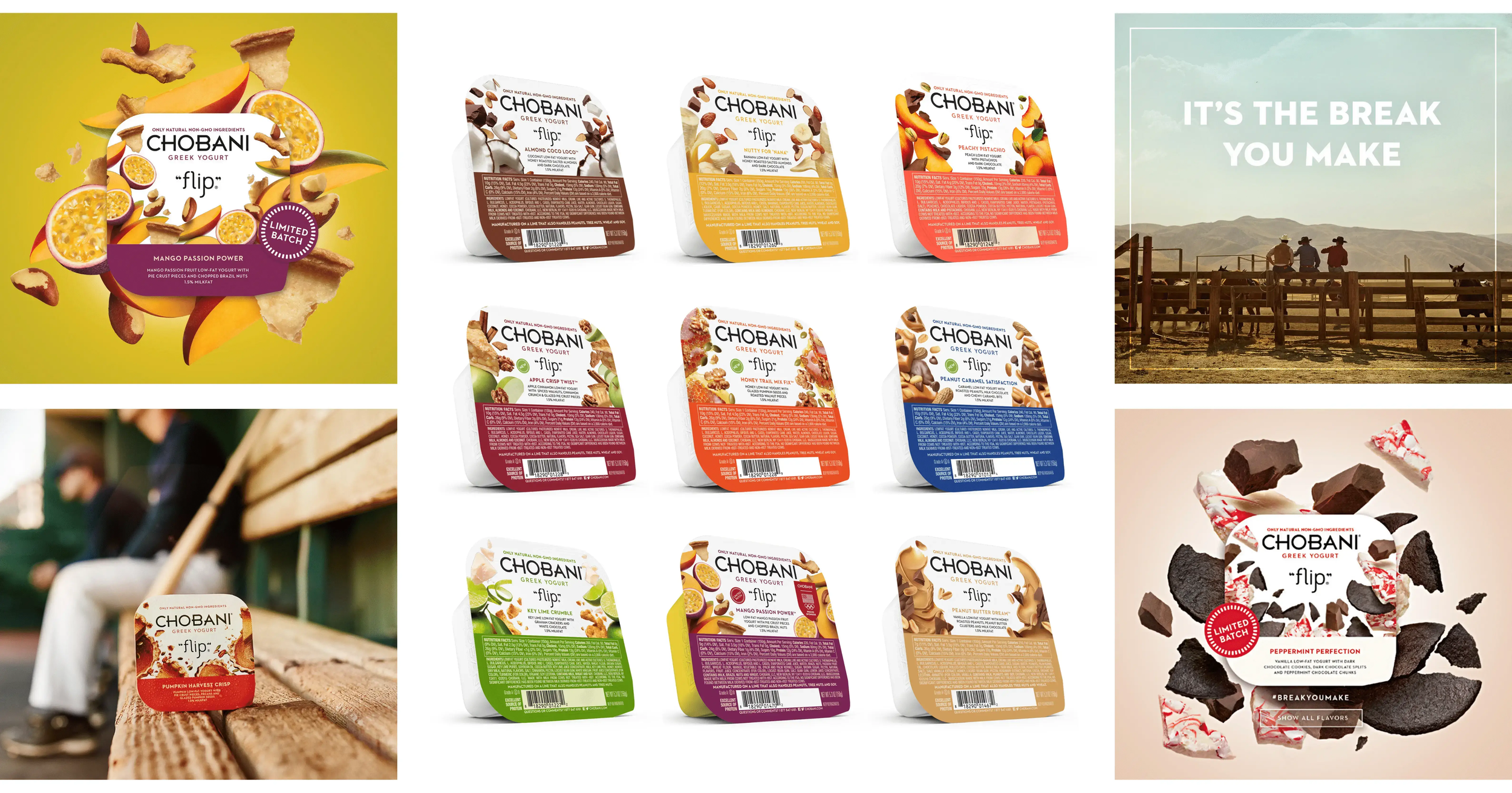
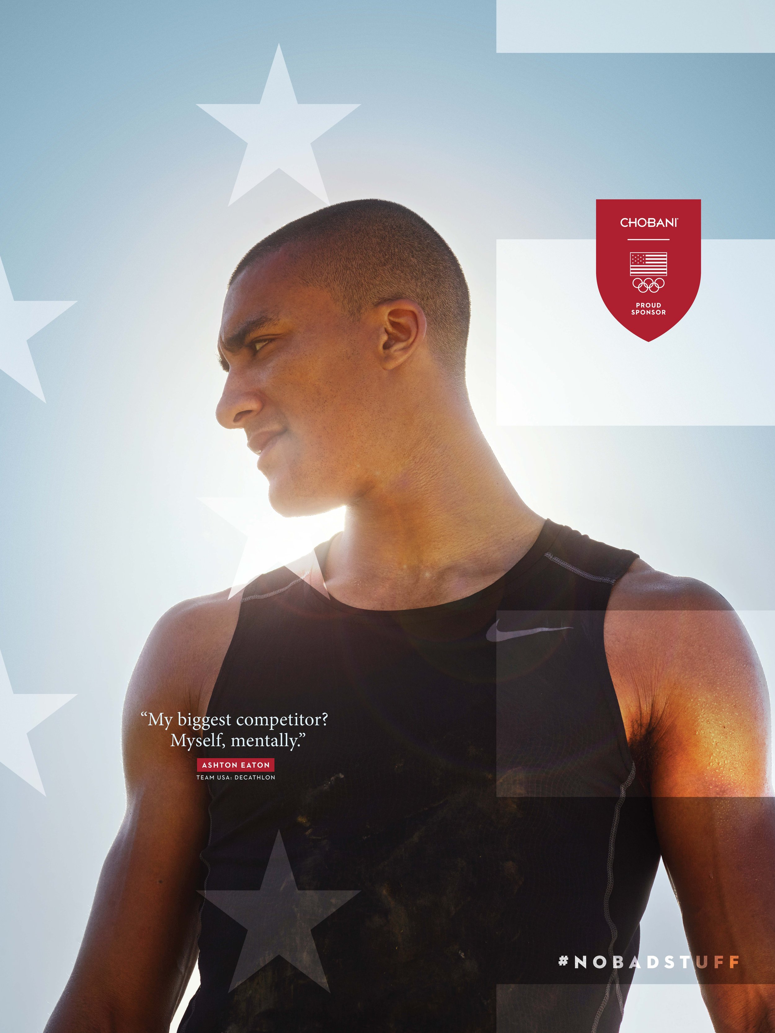
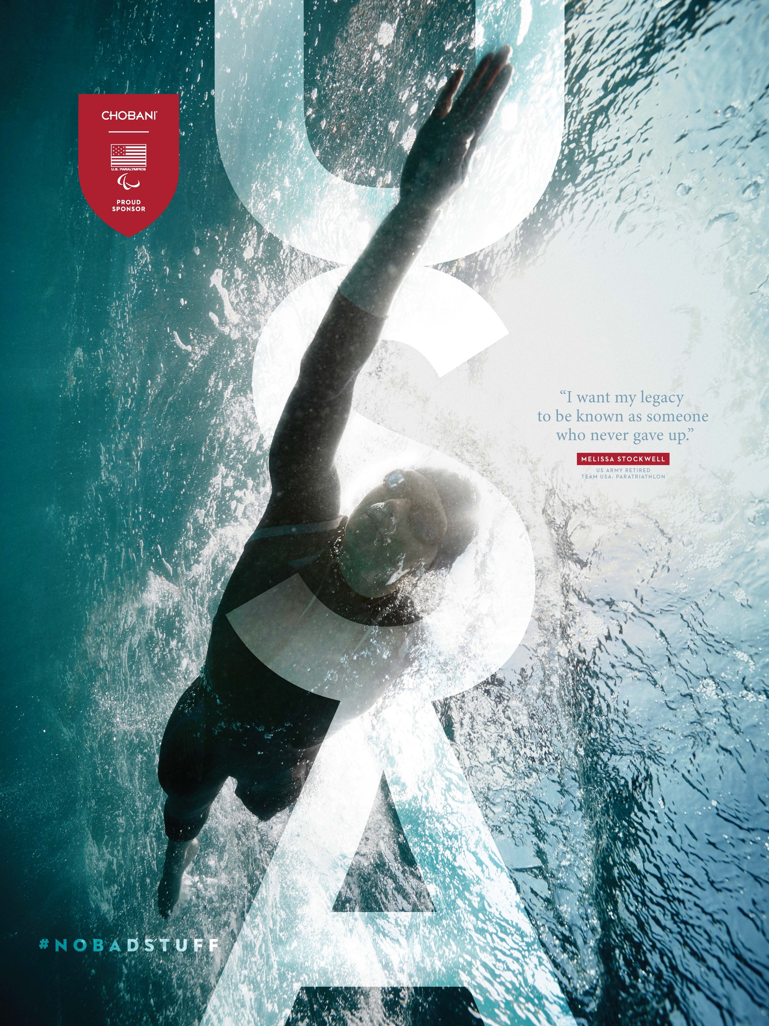
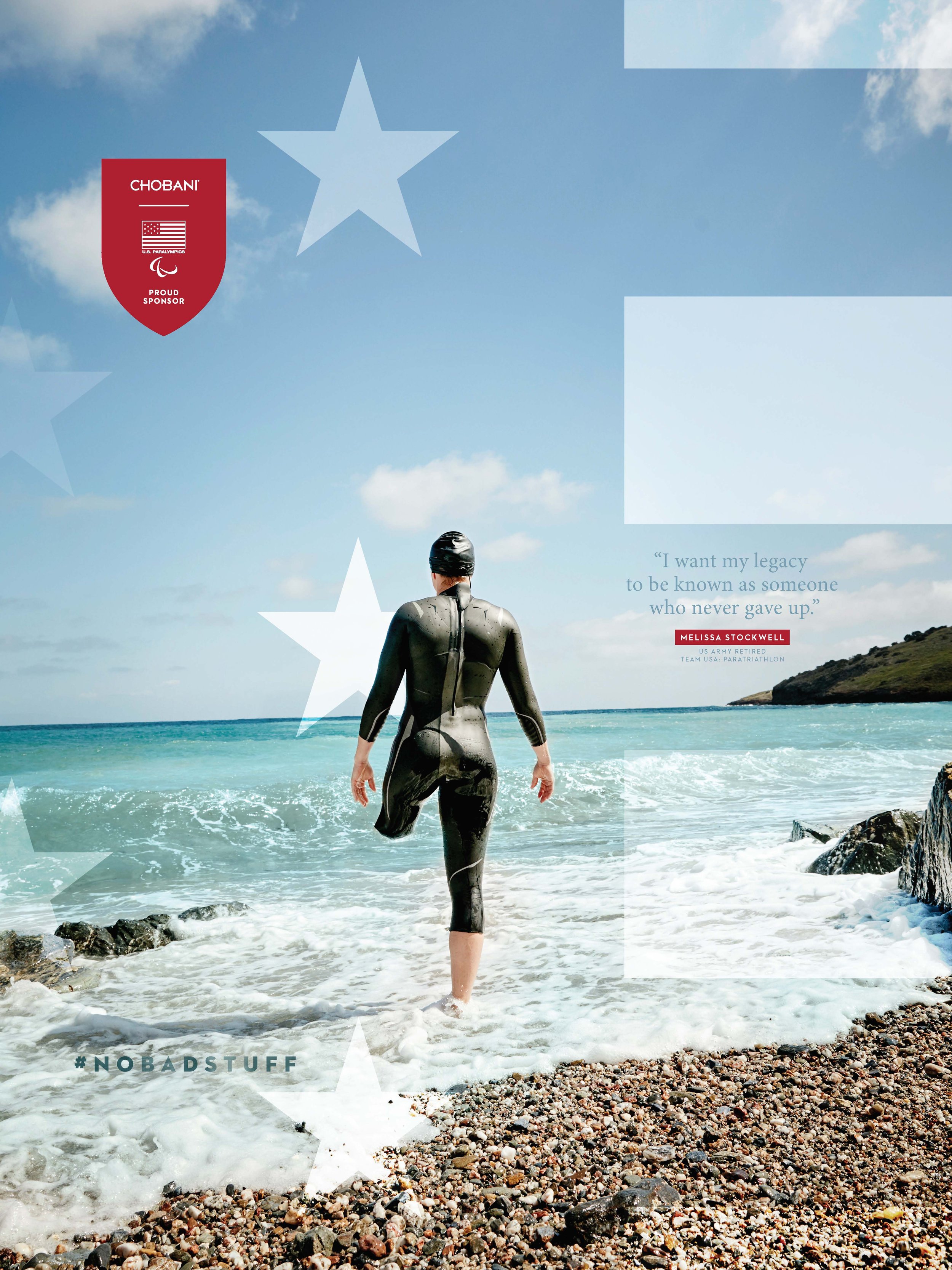
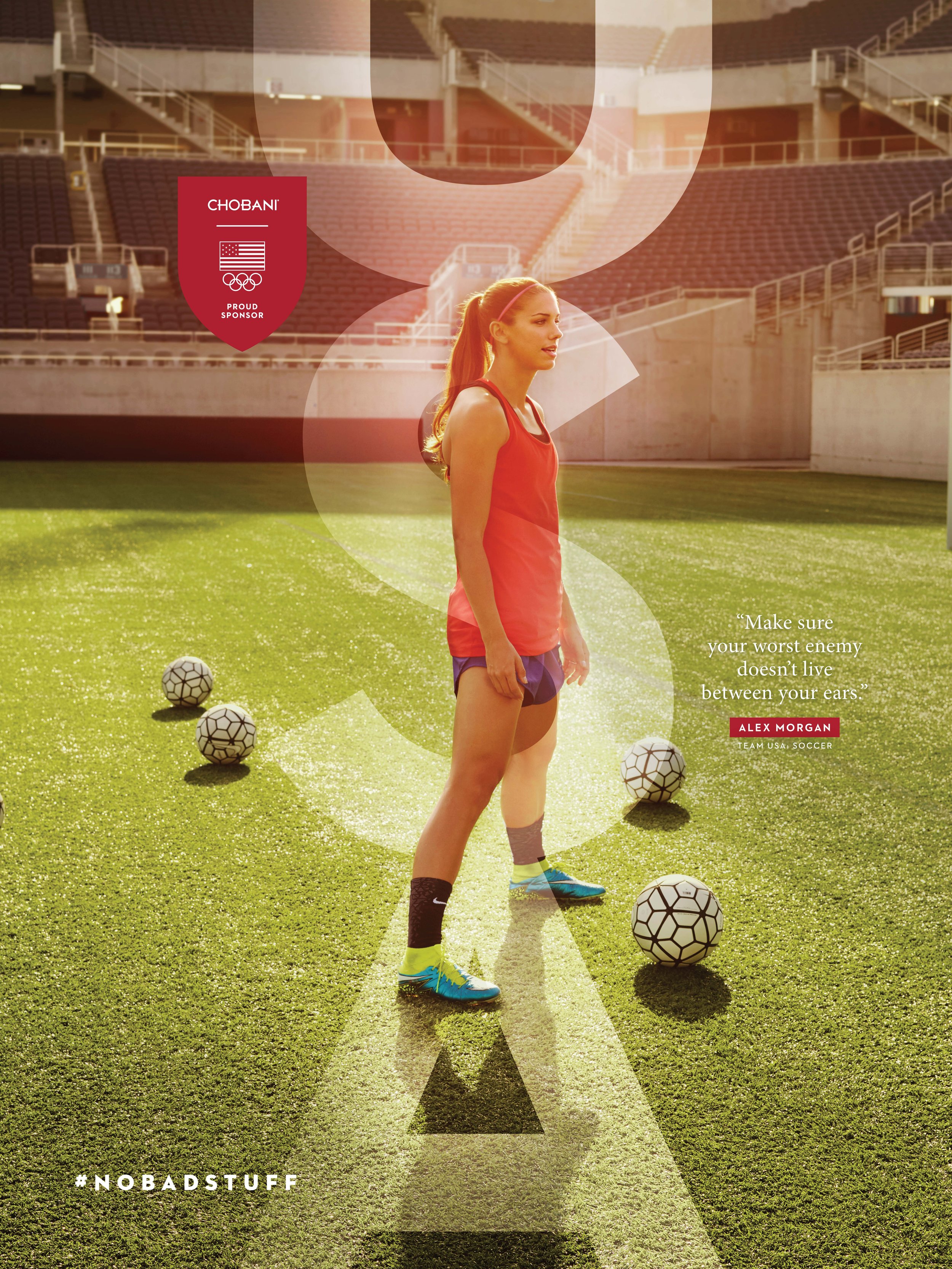
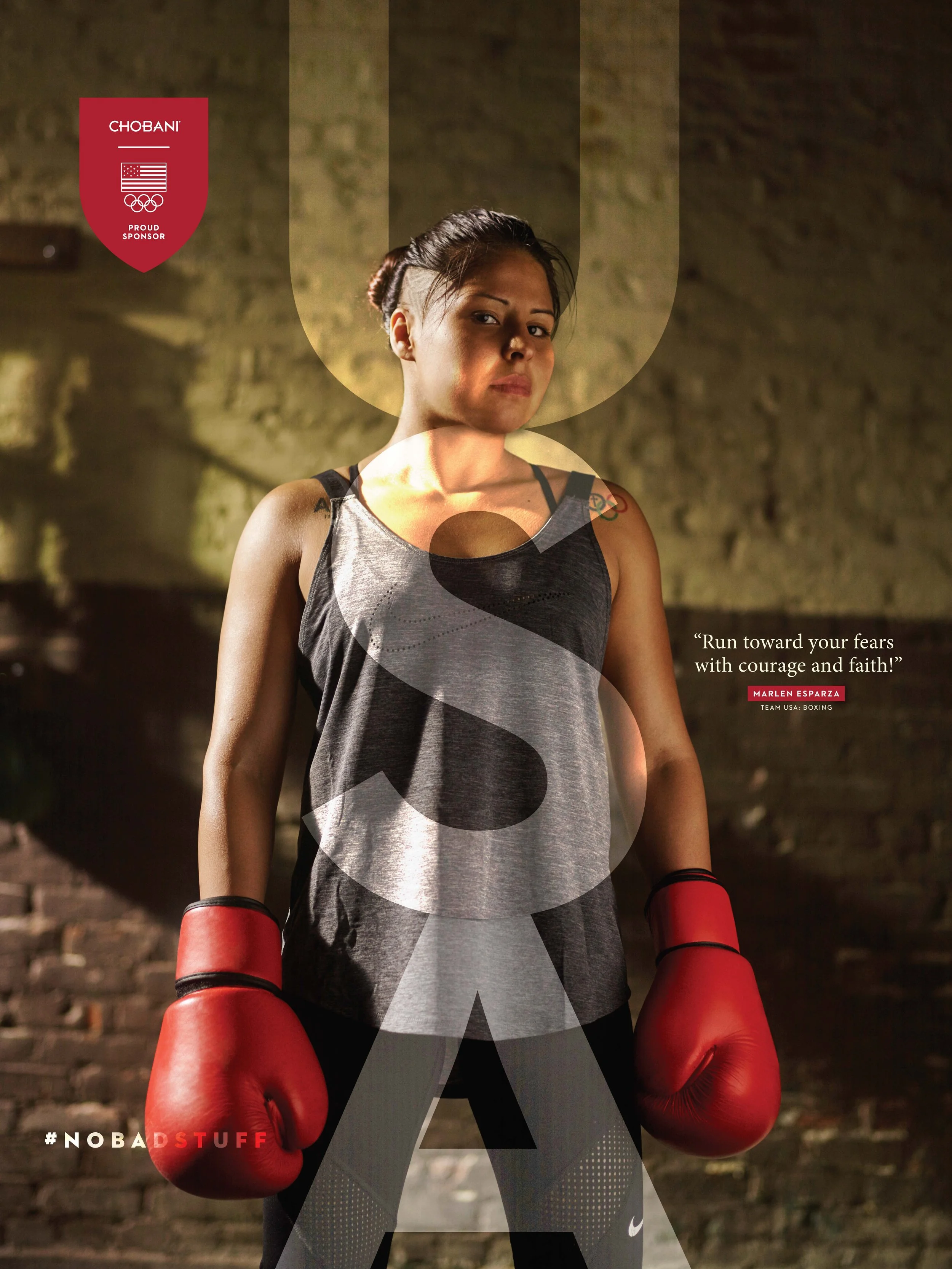
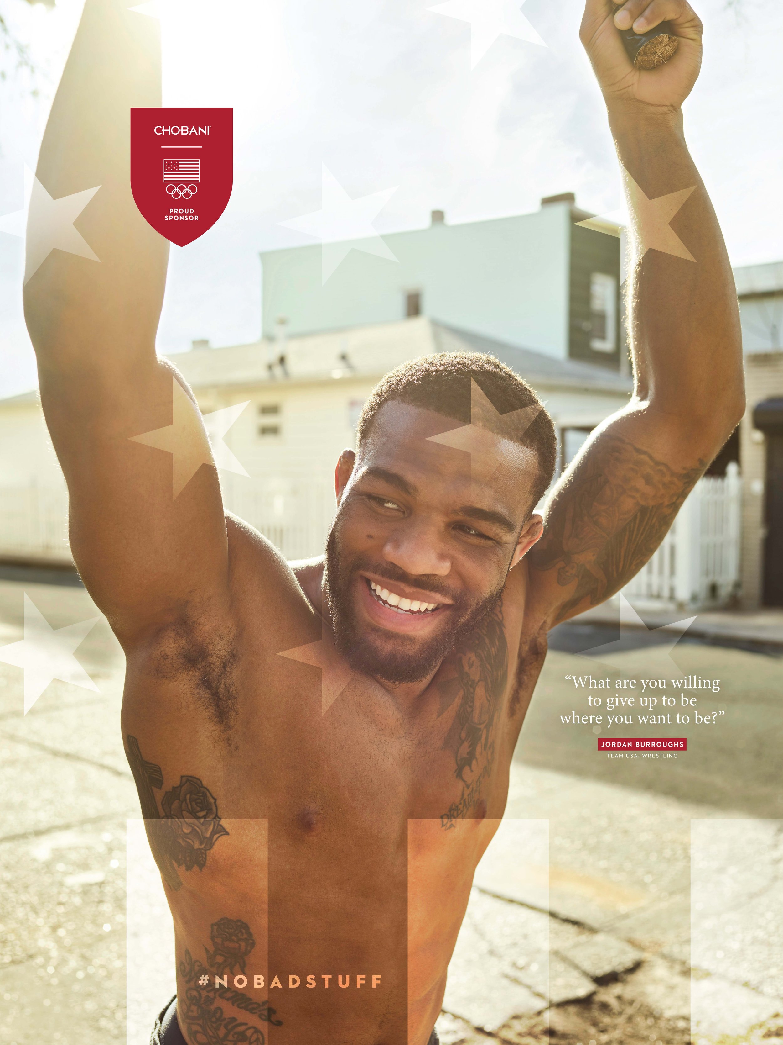
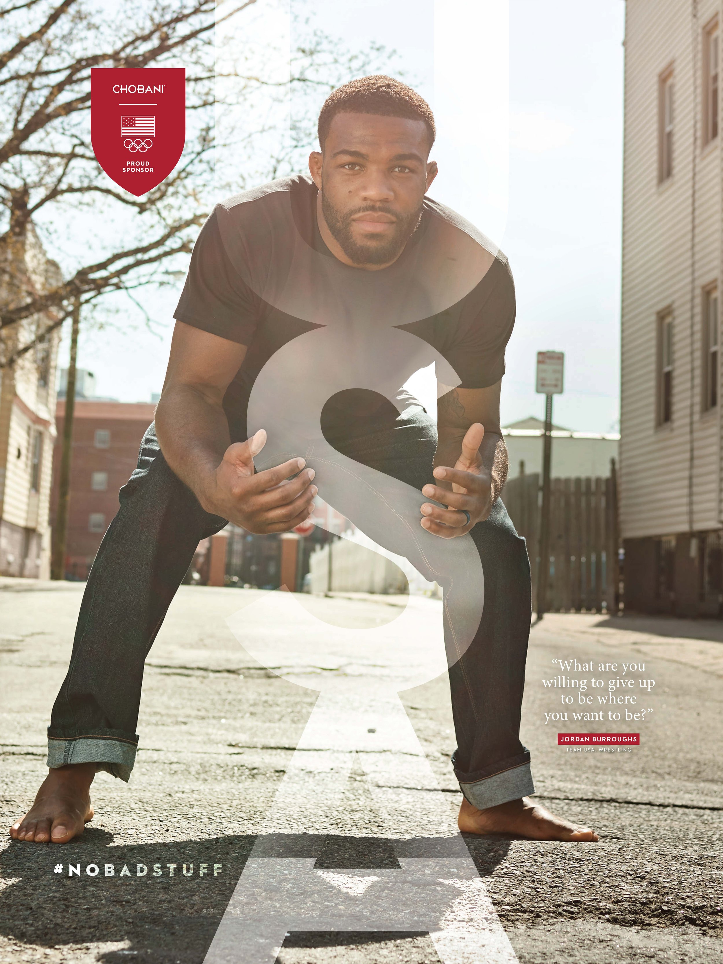
Tasked with revamping the packaging for their entire range—Flip, Fruit on the Bottom, you name it—I also got to design their Olympic sponsorship posters. Chobani had grown fast since launching in 2007, but their brand was all over the place, causing internal competition and a weak shelf game.CHOBANI
Packaging
Advertising
Art Direction
Social
Print
Animation
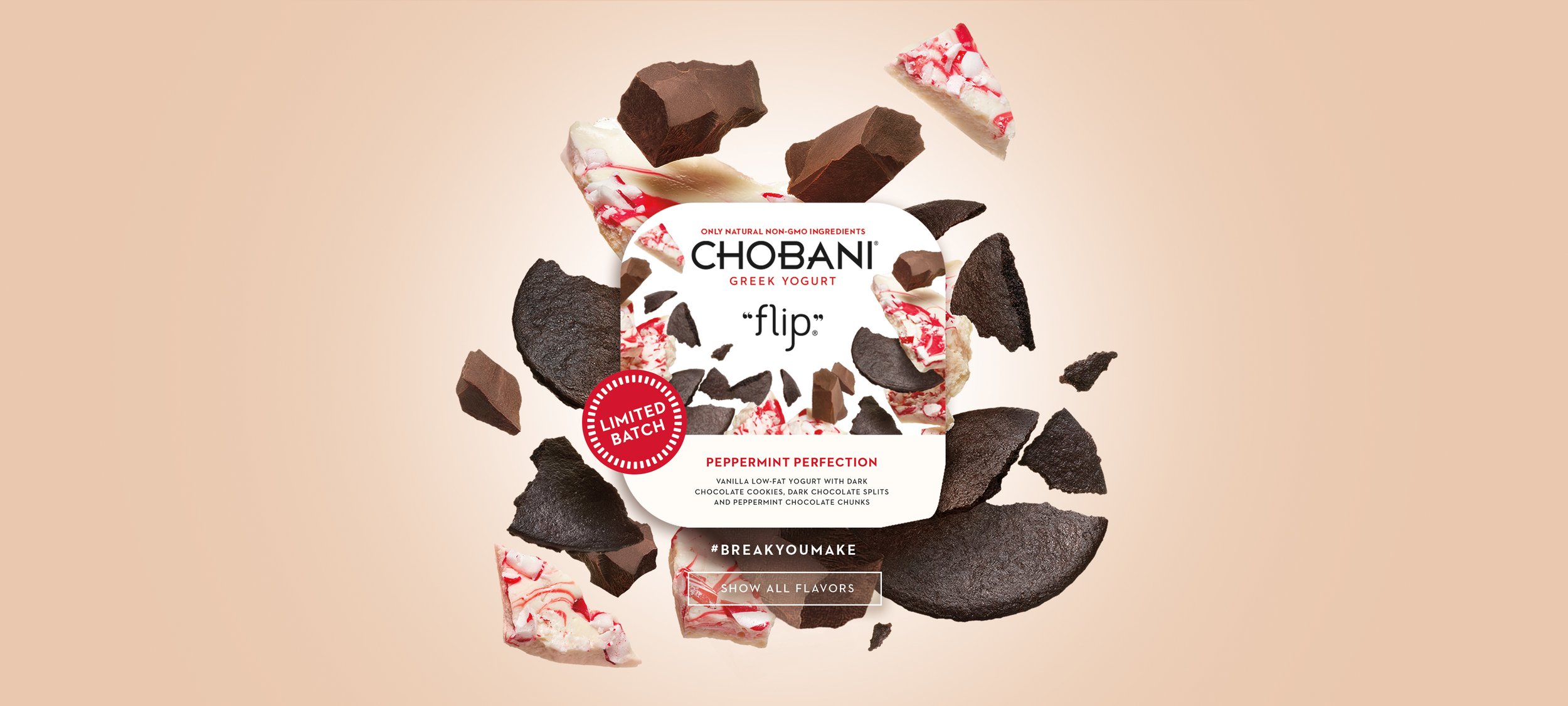


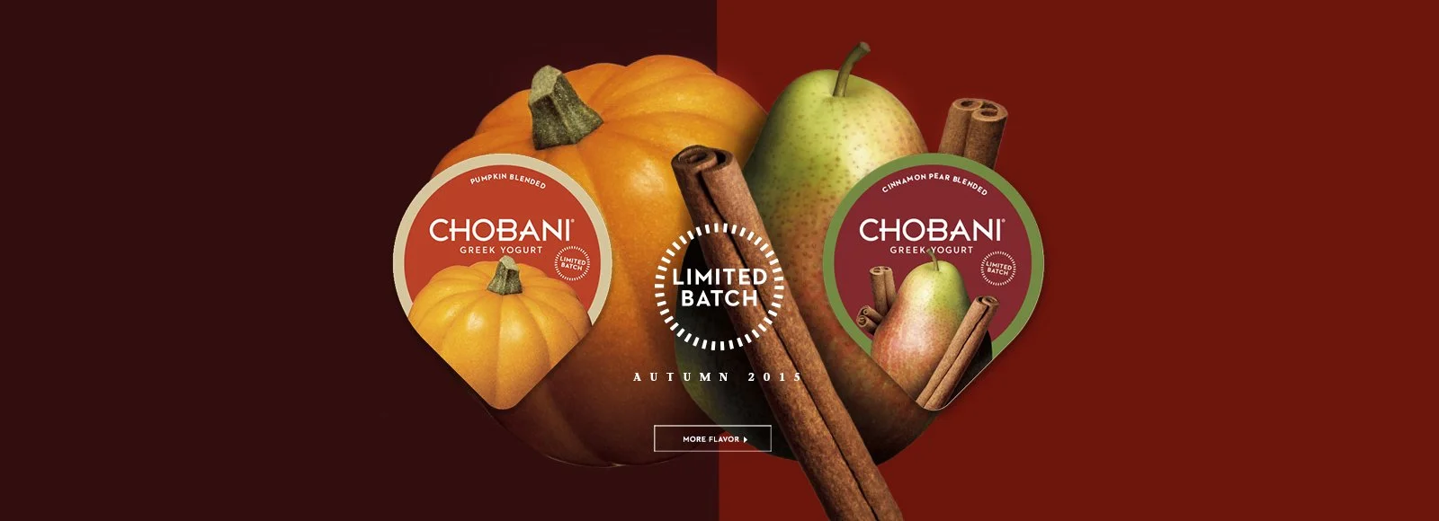

Chobani was all about following a mantra of "Simple, Consistent, Resonant, and Integrated," The aimed was to make the brand more approachable. alongside Benjamin Bailey CD on this project. We created a series of packaging that felt honest, vivid, and alive. Products such as Chobani flip, Fruit on the bottom, and drink.