RUK is a hemp cigarette brand built on the idea of freedom. The identity blends natural simplicity with bold symbolism—using the birdcage and shadow of flight to express release, choice, and a break from convention. From packaging to visuals, every detail was designed to feel grounded, minimal, and liberating.
Conceptual project.


BRANDWORLD


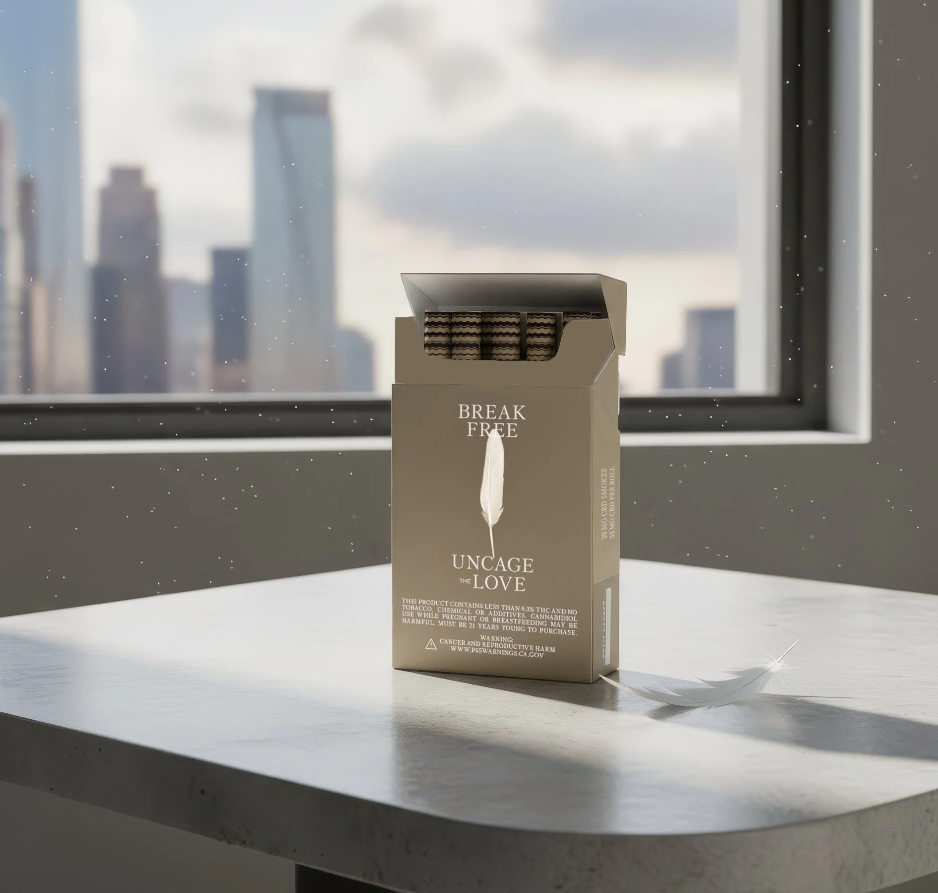
Uncage The Love
RUK means love in Thai. The ritual of a smoke break becomes more than habit—it’s a pause, a moment to breathe, a chance to break free. The tagline says it all: Break free. Uncage the love.
RUK’s packaging design translates this philosophy into a series of rotating messages—each box carrying words that speak to life’s weight, self-doubt, and the pressures of social norms. The outer voice reminds you: When life is trying to hold you down, break free, uncage the love.
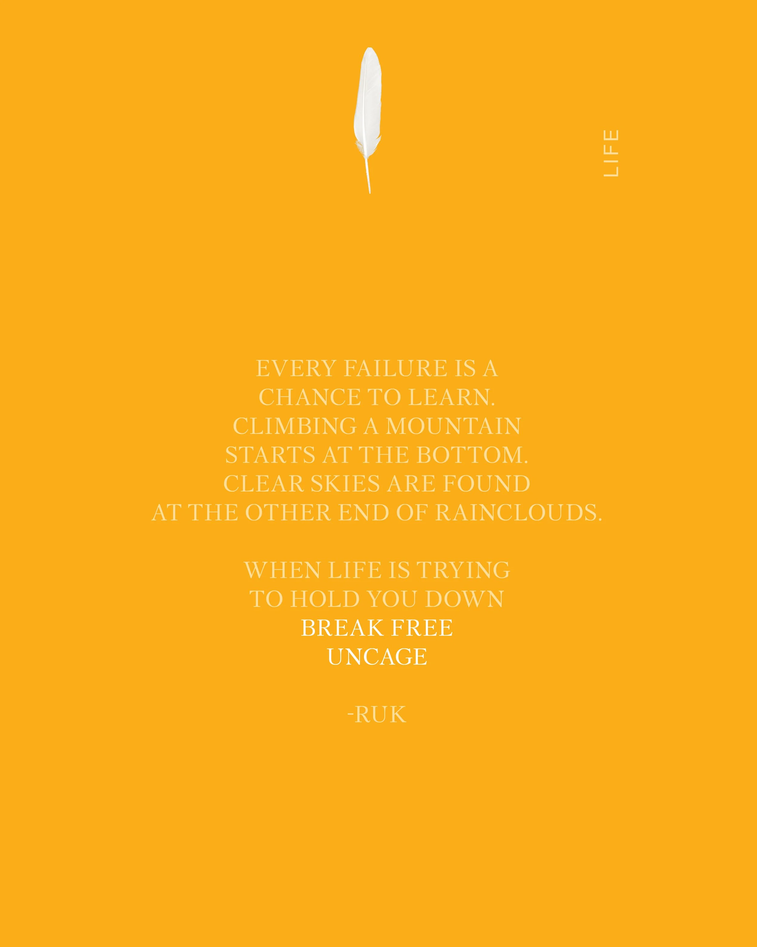
Life: Every failure is a chance to learn. Climbing a mountain starts at the bottom. Clear skies are found at the other end of the rain clouds.
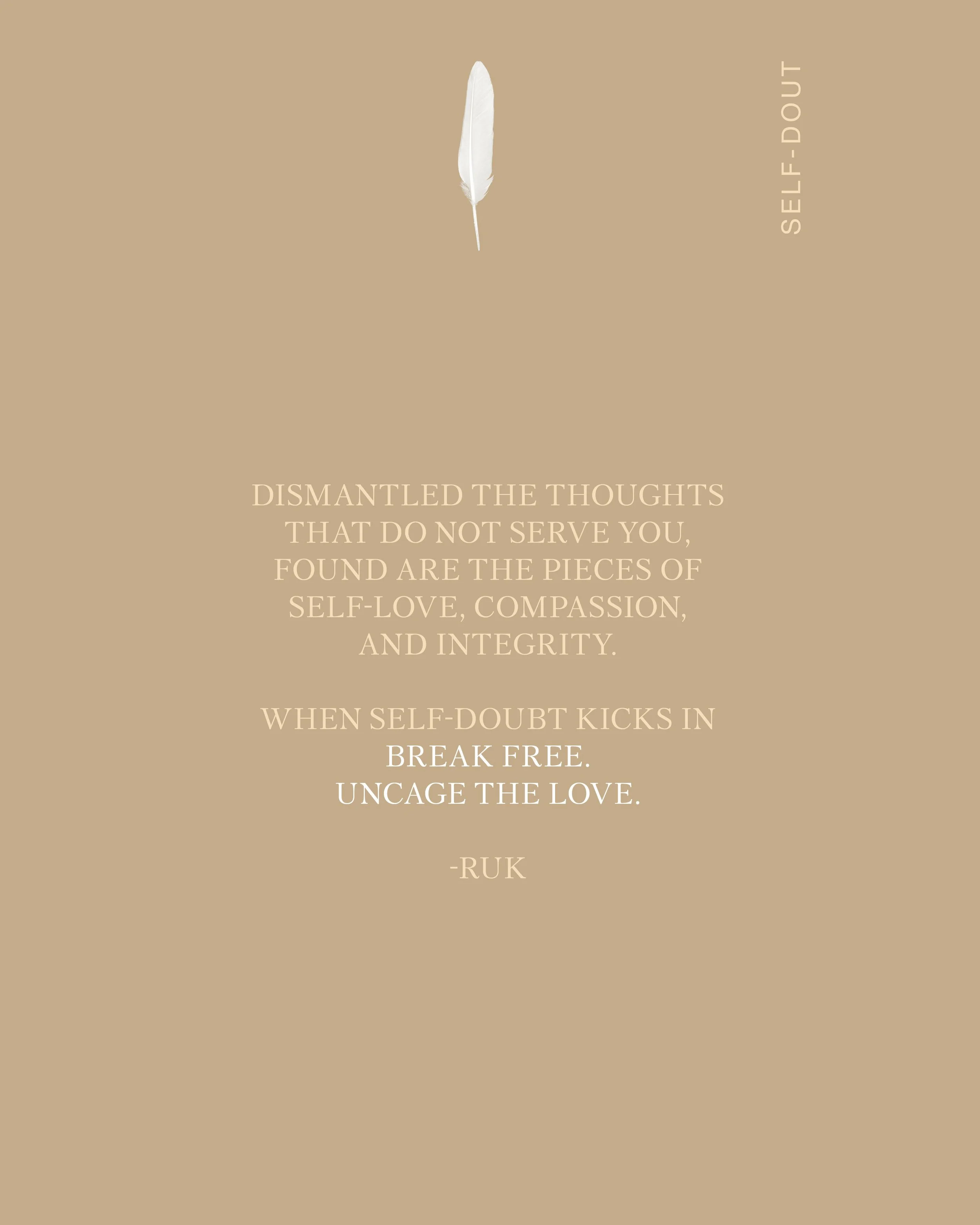
Self-Doubt: Dismantle the thoughts that you do not deserve. Find other pieces of self-love, compassion, and integrity. Revive yourself. Get lost in the wonder of your own possibility.
Social Norms: When the world pushes to define you, step outside the cage. Explore, question, and create your own rules.
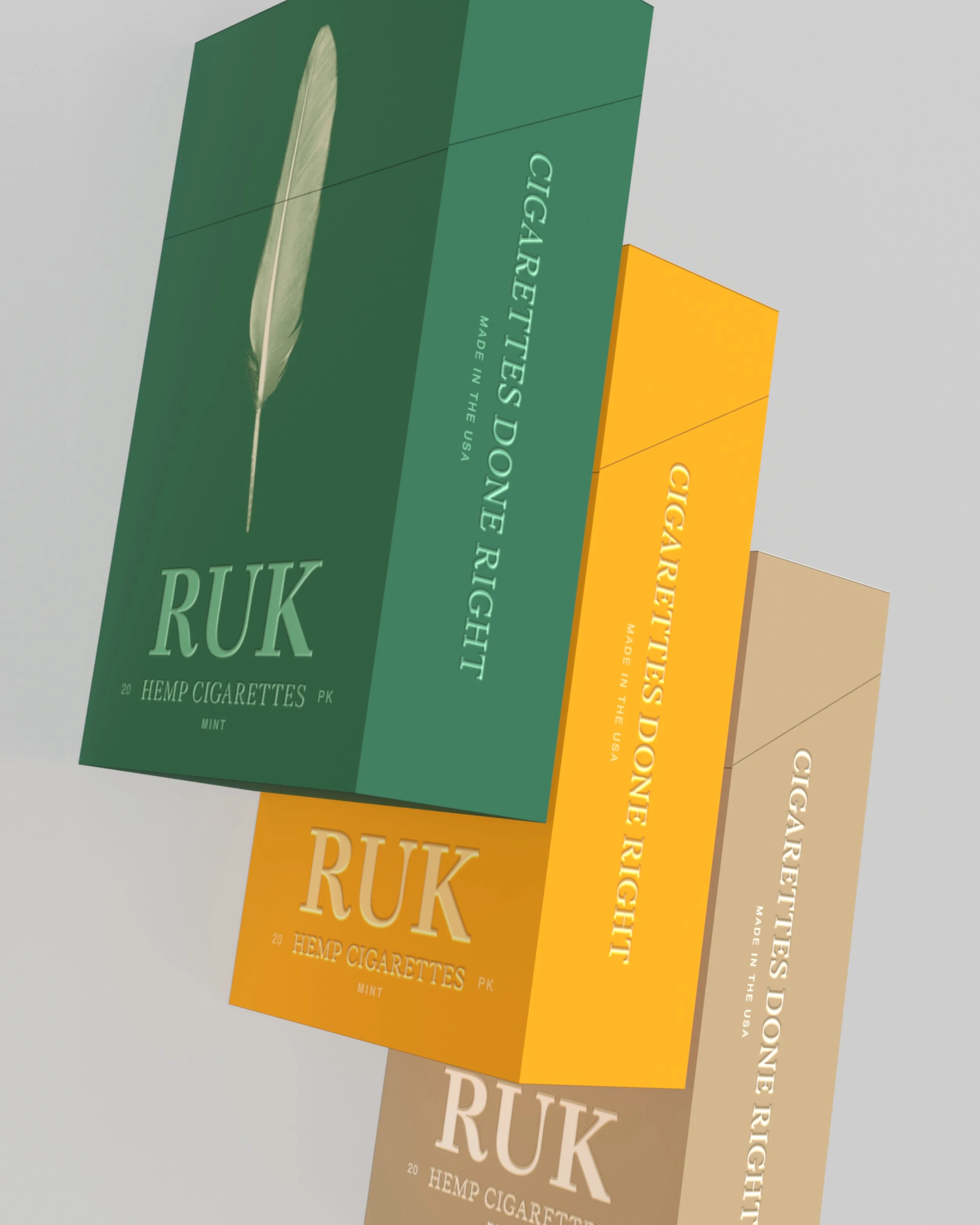
Each pack is more than a container—it’s a manifesto. A design system where words, color, and space remind you that freedom is an act of love, and every smoke break is a break from confinement.


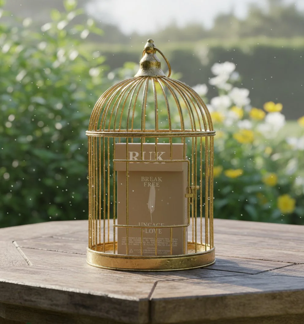

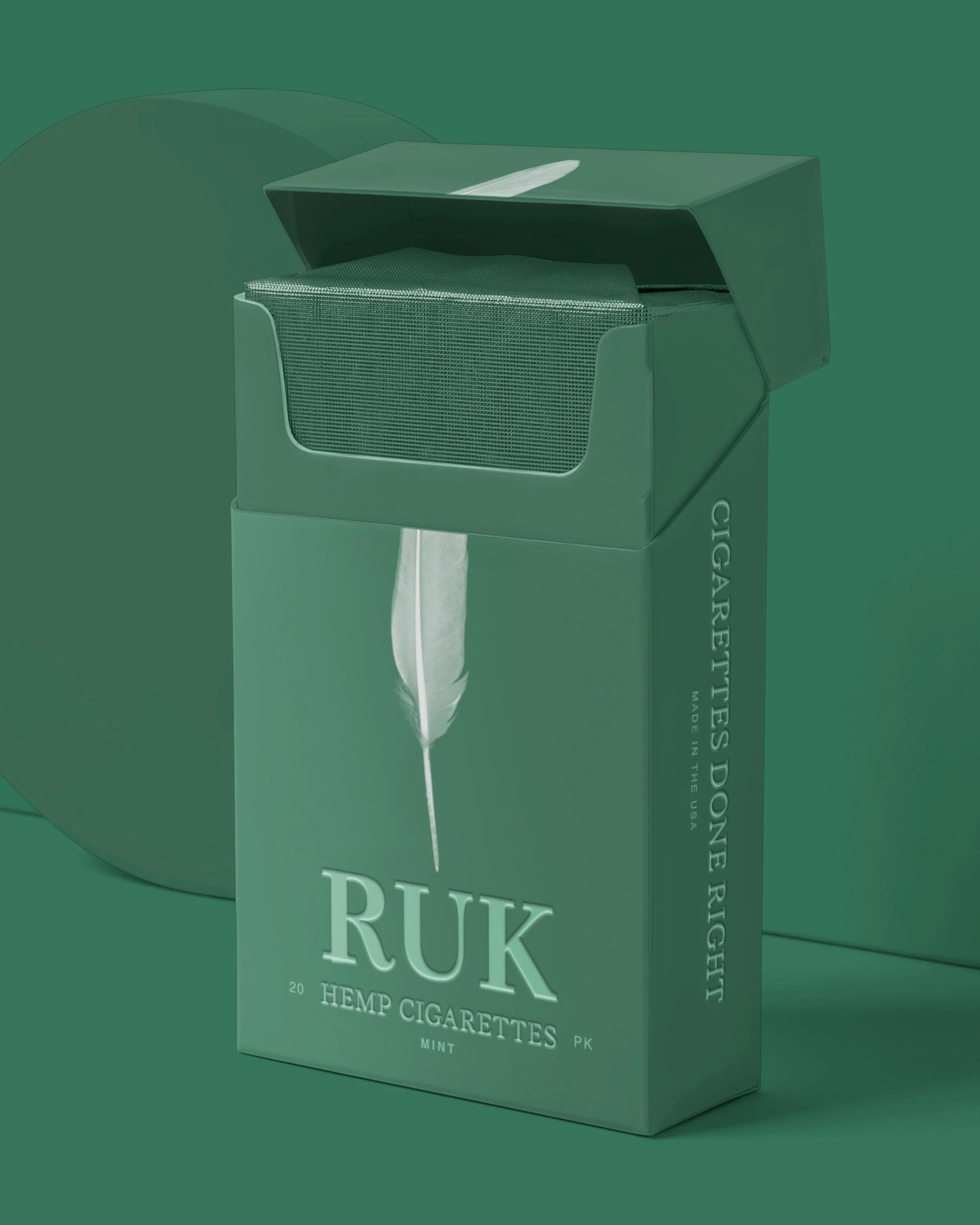

A cigarette brand designed to break free from its own cage. The RUK brandworld is built on rebellion, escape, and transformation—where packaging isn’t just a box but a stage for storytelling. From birdcage removals to striking visuals, every element of RUK carries the tension between being trapped and breaking out. It’s a world that feels raw yet intentional, a space where design provokes, challenges, and liberates.
