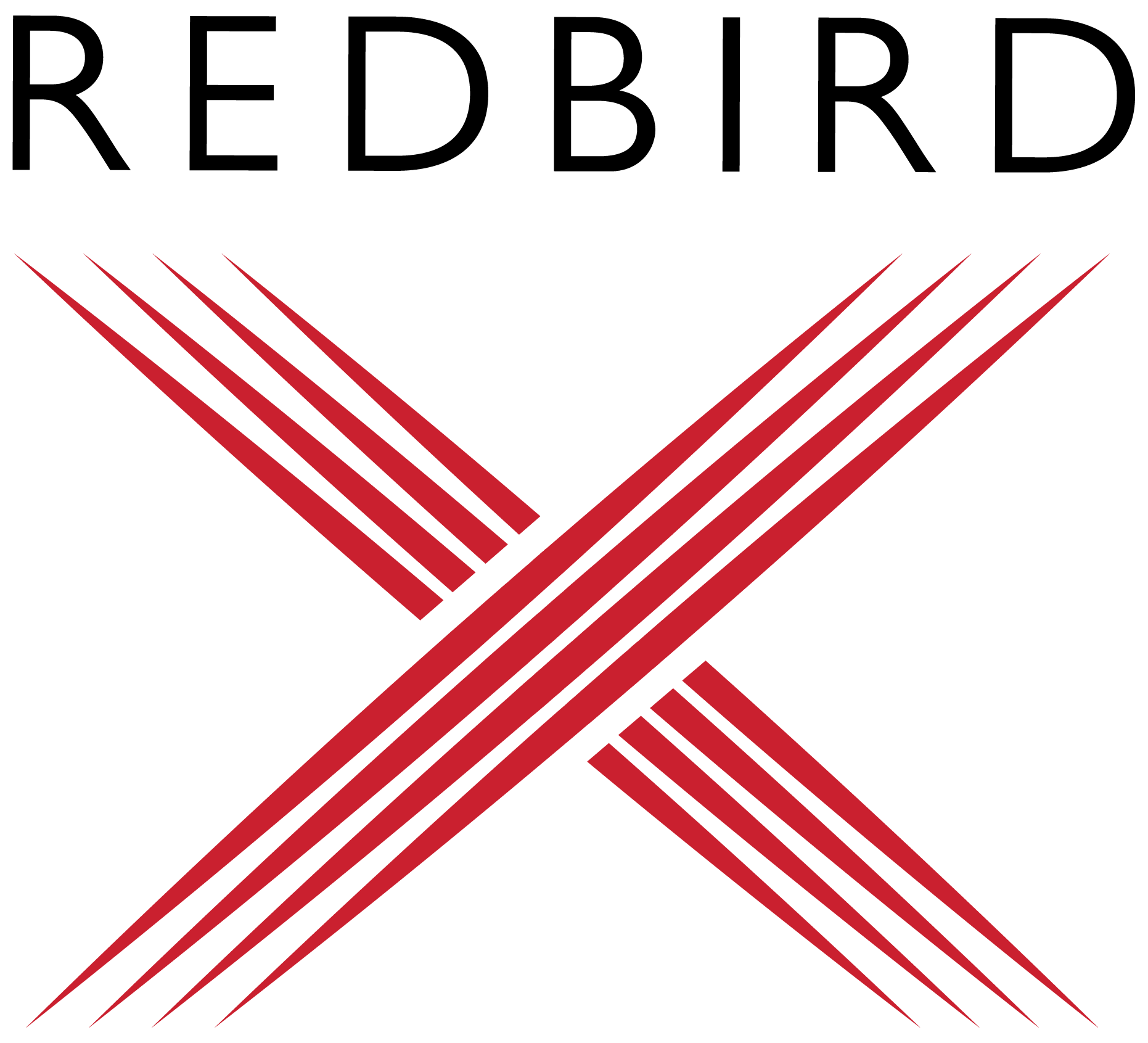
Redbird needed an identity that felt like technology — sharp, current — but still read as luxury for their high-end clientele of entrepreneurs and family offices. The harder problem: they hire constantly and keep expanding into new verticals, so the system had to grow without ever needing to be reinvented.
I built the full identity in 2022 — logo, color, typography, stationery, social, digital applications, even a foundation sub-brand — then kept developing it as the firm scaled. Years later, I'm still extending the system for their newest ventures. It's the one project on this site that's mine, start to finish.
REDBIRD CAPITAL PARTNERS

Redbird Capital Partners
I designed the mark to hold two ideas at once: grounded enough for a firm managing billions, agile enough for one that was still actively expanding into new categories. The wordmark is unshakeable — bold, structural, no ornamentation. The bird carries the movement — a single continuous line that reads as motion without ever feeling loose. Every proportion in the system traces back to that tension: precision that doesn't calcify into stiffness.
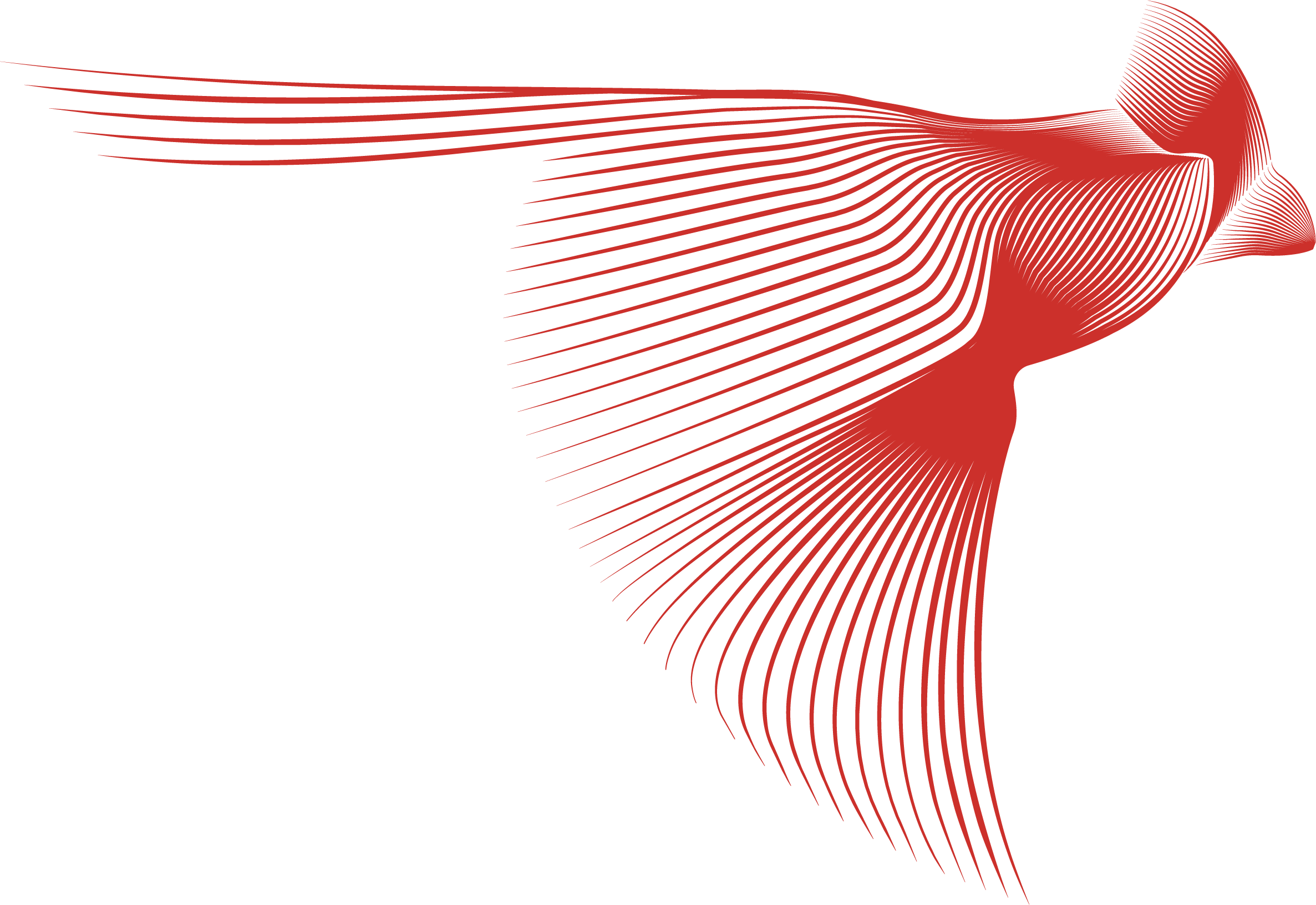
Redbird Development Group
When RedBird expanded into real estate and infrastructure, I extended the system rather than starting over — same typographic logic, same restraint, recolored and rebalanced for a division built around long-term physical assets instead of financial ones. The goal was that anyone moving between RedBird's business lines would recognize the family resemblance immediately, without the sub-brand ever feeling like an afterthought.
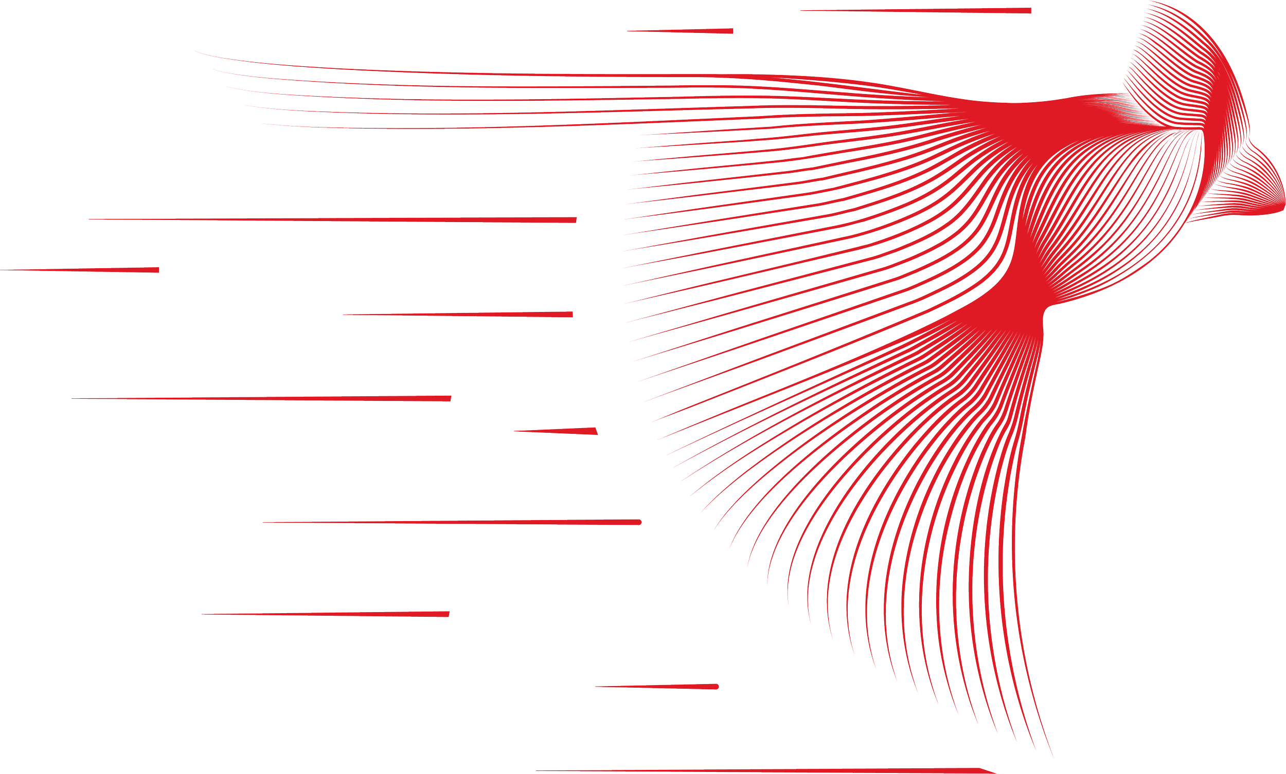
Redbird Capital Foundation
The Foundation needed to read as RedBird without reading as commercial — this is the philanthropic arm, and the tone had to shift accordingly. I kept the core mark intact but softened the palette and introduced a warmer accent color, signaling continuity with the parent brand while giving the Foundation room to feel like what it is: a different kind of commitment.
AC MILAN
In 2022, RedBird acquired AC Milan — one of the most storied clubs in football history — and the identity system had to prove it could stretch into an entirely new register: sports, global fandom, a different cultural language altogether. I worked within the existing brand logic to make sure RedBird's presence around the club felt like ownership with intention, not a financial firm's logo bolted onto a jersey.

Redbird X
RedBird X is RedBird Capital Partners' proprietary artificial intelligence business — created to build and commercialize AI companies, products, and applications across sports, media and entertainment, and financial services. Powered by an in-house team of AI engineers, the platform brings together enterprise deployment, product development, strategic investment, and a modular technology stack designed to scale across the firm's portfolio.
I developed the RedBird X identity as an extension of the broader RedBird system. The mark preserves the structure and authority of the parent brand while introducing a sharper, more dynamic expression — positioning X as the point where capital, technology, and company-building converge.